

In this project me and my team digitalized Bjergestam Change Institute’s courses
-
Context
Bjergestam Change Institute teaches different approaches, tools and methods for teambuilding and leadership. His target group is leaders in various fields. Per has developed exercises and course materials for over 20 years. The courses are analogue and they realized that they need to digitize the business.
-
Impact
Good leadership is the foundation for operations and employee well-being and results.
The purpose of this service is to contribute to viable organizations that more people want to belong to.
-
Solution
A digitalized version of Change Institutes courses. We used gamification to create engagement and incitaments for the users.
Final Prototype
The Solution
For the purpose of this project, there was 1 prototype created in Figma to create a first impression of the digital service. The images and video below showcase a first version of the solution.

Small tour of the platform
This video shows what a user sees when logging onto the platform.
Listening exercise
This video shows one of the exercises that are available in the platform. It is based on one of Per Bjergestams courses for building stronger teams.
Project-details
Tools: Miro, Figma, Photoshop, Illustrator
Team: Group of 2
Duration: 3 weeks
My role: Market research, UX design, Wireframing, Prototyping, User testing, UI design

Define&Ideate
The Process
In order to get a clear overview of the challenges and opportunities we saw with digitizing Per's training material, we started our project by making a Lightning and Decision Jam in Miro. We then had a clearer picture of which hypotheses we wanted to proceed with and validate. We saw that the main key assumption we wanted to proceed with and validate was to use gamification to facilitate the digitization of Per's course materials.

After we realized that we wanted to create a service with gamification, we moved on to sketching and brainstorming solutions.
Crazy 8 is an exercise that challenged us to sketch eight distinct ideas in eight minutes. The goal was to create a variety of solutions to the same challenge.
After we sketched out different ideas, we went on to sketch out concept ideas to more easily visualize what our future prototype could look like.
We sketched out 6 (instead of 8 this time around) images each and then put red dots on the elements and functions we wanted to move forward with in our concept.
The next step was to find a way to plan out and show how the user would interact with our future service. To do that, we created story boards. When we had a clear story board and knew in which order our user used different parts of the service, it was easy to move on to the next step; to create a flow chart.
We created a flow chart to document, analyze and plan the process of the service. This gave us a good overview and a clear picture for our prototype. Each part of the flow chart would become a frame in our prototype.


Wireframes&Prototype
The Process
We created wireframes based on our user-flows and tested out different functions with testers to make sure that the usability was OK.(See image 1)
After our usability tests with simple wireframes we went on to create the UI for the service. (See image 2)


Usability testing
We contacted a total of 4 users who got to test our prototype. After our user tests, we compiled the test results into a table where we categorized the ambiguities encountered by the users.
The Process

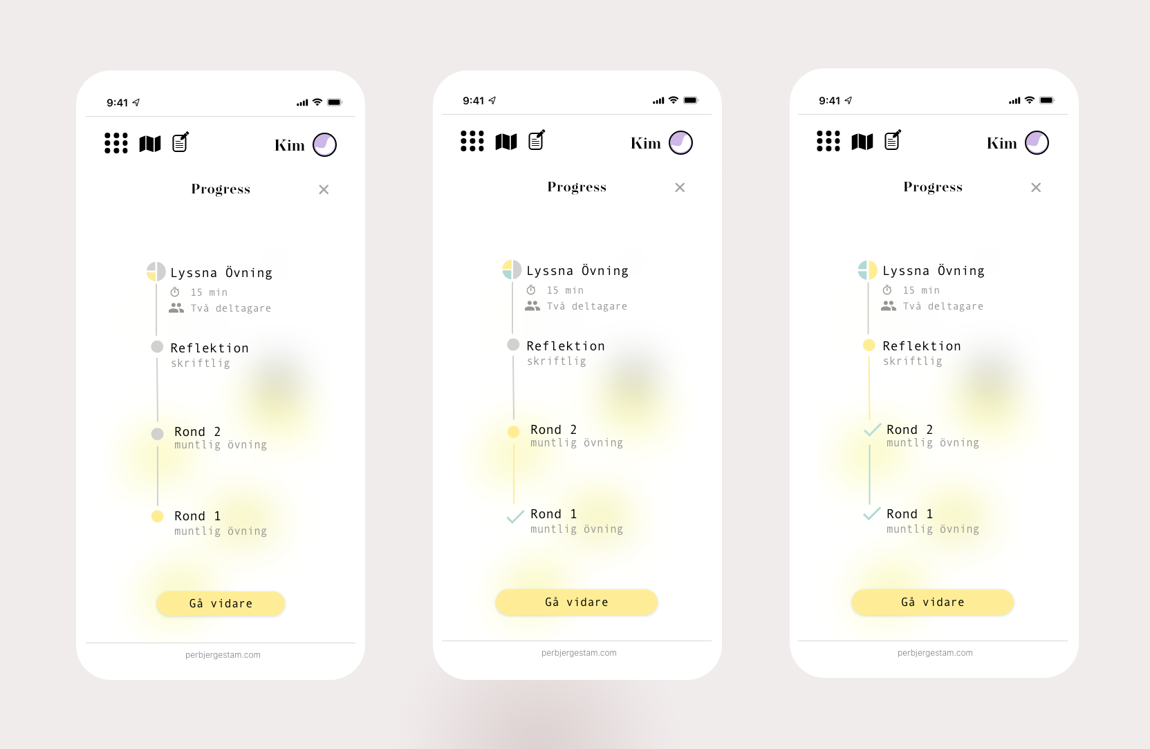
We chose to use qualitative testing and sat with the people who tested our prototype while we took notes and asked questions to the testers. We gained many insights during our tests that led us to make some changes to our prototype. Among other things, we realized that we had to replace some elements that was confusing for the testers. That included some elements that they thought was clickable, but it wasn't. We also realized that we needed to use more colors in our progress frames to make it visible how far they came in the exercise.
However, the majority of feedback we received during our tests and interviews was positive. The testers felt that the prototype was clear and easy to understand but also fun to execute. This validated our hypothesis that gamification facilitates learning and makes the experience more vivid and memorable.
Usability test-findings
User interface
After we designed a round logotype, it was natural that we chose to work with round shapes throughout the flow to maintain the common thread.
For example, I chose to also design the hamburger menu with dots instead of lines to maintain the soft, airy feel.
I then mixed the round shapes with abstract shaped elements to make the impression more alive.
We want to emphasize a pleasant tonality together with a serious text font. Therefore I chose the font Operetta 18 for the title and Andale Mono for the body text and button text.
We felt that illustrations were important to balance out all the text. The motifs should illustrate what task you are on in various moments, for example talking or sitting and listening. The illustrations are made on Procreate, drawing app for iPad.
We also chose to include illustrations because visualization is a helpful tool in learning.
The Process
